Exploring Data
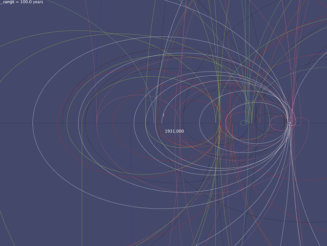
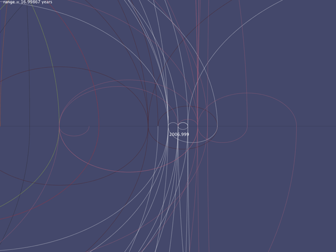
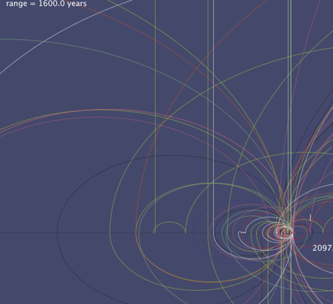
One of the hardest things about working with data is understanding the shape of it. With large or complex data sets it is good practice to use simple tools to try and introduce some other ways of looking at the data other than a spreadsheet. If the tools do not exist then they must be made!During the wireframing process I programmed a quick program that plotted all the journeys using Processing. You could zoom in and out on it and slide the mouse from side to side to move forward and back in time. It wasn't really something that we were going to use as a finished thing, but as a tool to see where the most interesting eras where, it was pretty cool.
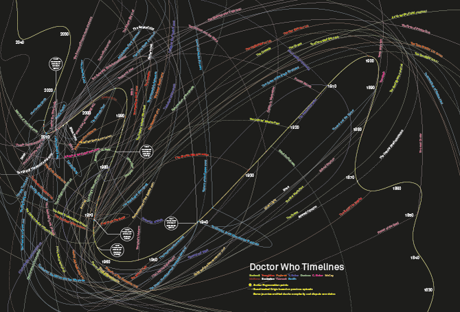
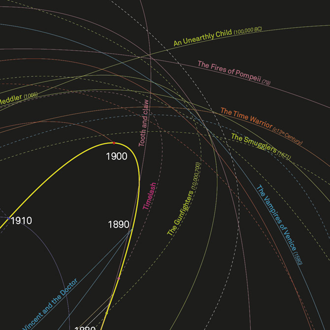
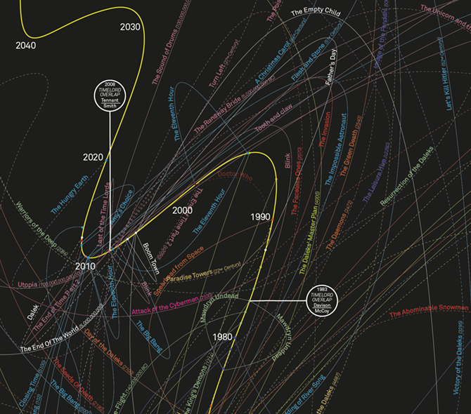
Here is an overview of the finished piece and a couple of details. Most of the lines were put in place by the amazing Piero Zagami.