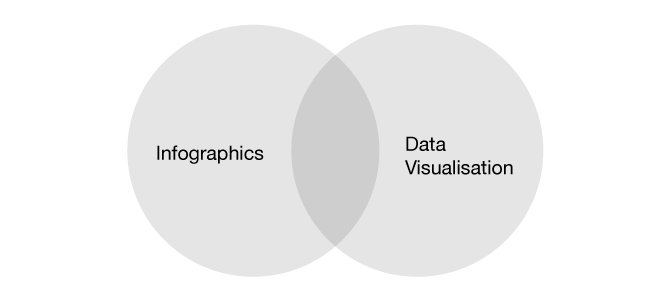
It's probably a better question to ask 'What's the similarity between an Infographic and a Data Visualisation'.
Let's first look at what's similar, then break down each one in turn in order to both define and compare them.
They both seek order, and it is always the intention that they should be informative. They are both visual representations of data. They convert data (usually numbers) into graphics. They can both be static, interactive or animated.
They are both convergent fields, in that they involve highly skilled people from a large number of disciplines, such as programmers, designers, statisticians, journalists, developers, geneticists, economists and so forth.
Infographics
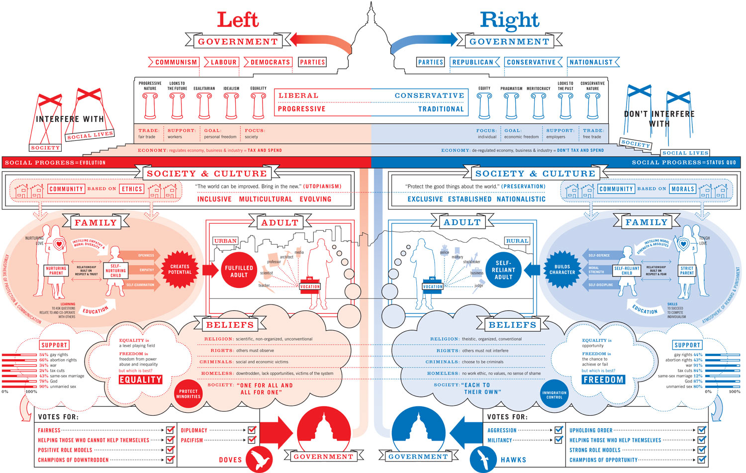
Information is Beautiful - Left Vs. Right
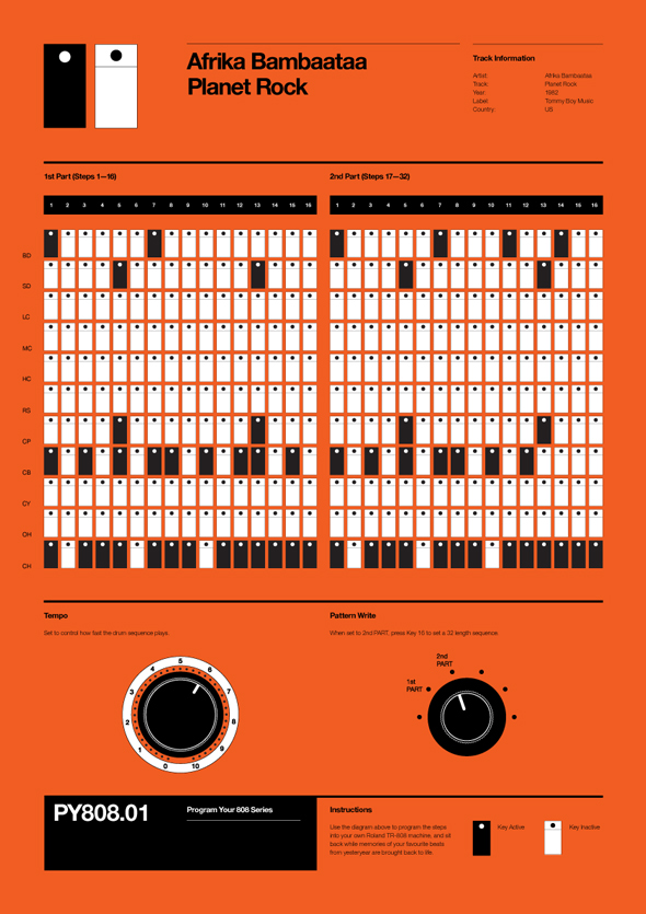
Rob Ricketts - 808
Infographics are generally created for the purpose of telling or explaining a specific story, and will usually be intended for a specific audience, thus Infographics are subjective. They are self contained and discrete: it is information presented with context; sensitivity designed and presented in a way that is accessible for an audience. The graphic design of an Infographic will be obvious; as it will be designed for that audience, or to fit in with a website or off-line publication's pre-existing style. Often illustrations, iconography and other graphical flairs are used to illuminate the content. As this is the case, it is usually necessary that each one be constructed by hand, although there are tools that are available to make them using templates.
The method of presentation that is used for one Infographic cannot usually be used for another. They can take a more holistic approach to a subject, and bring in related information that can be unquantifiable — e.g. a quote that sets a mood. An Infographic is an item.
Data Visualisation
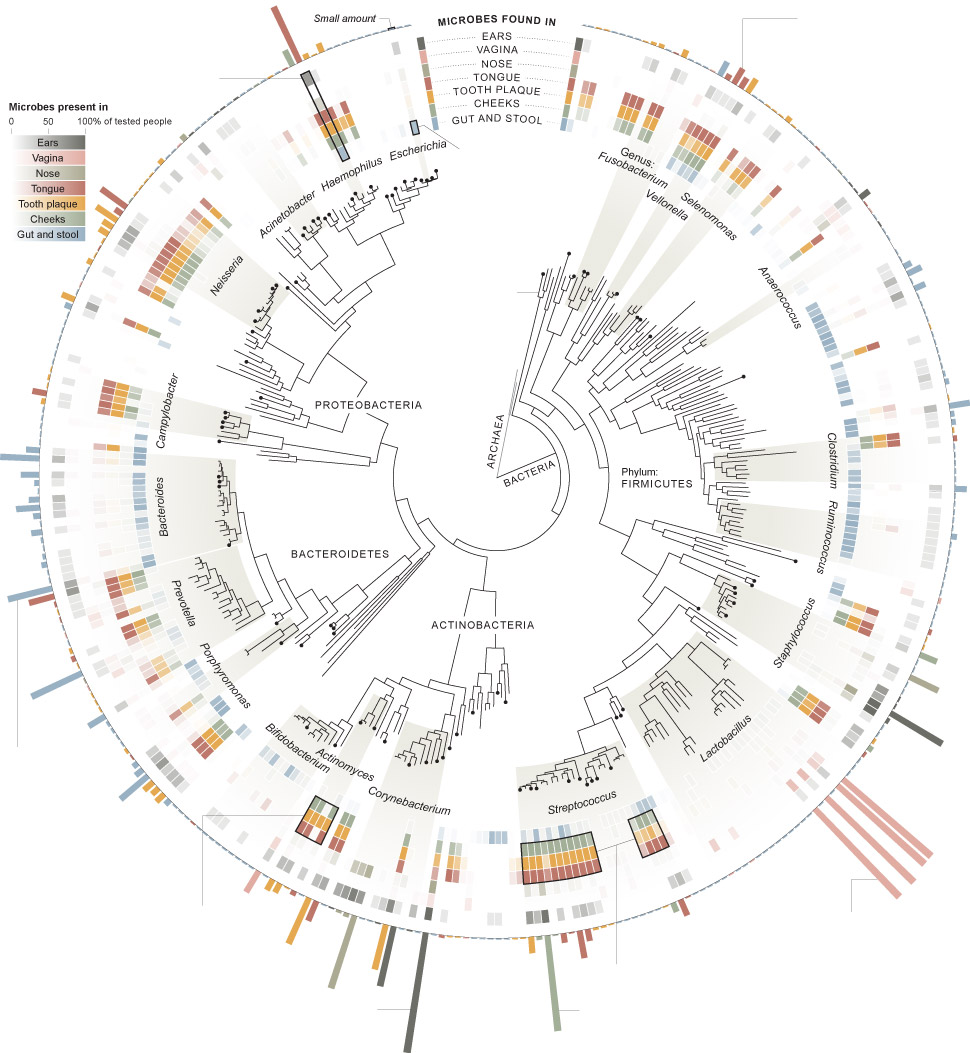
NY Times - Microbiome
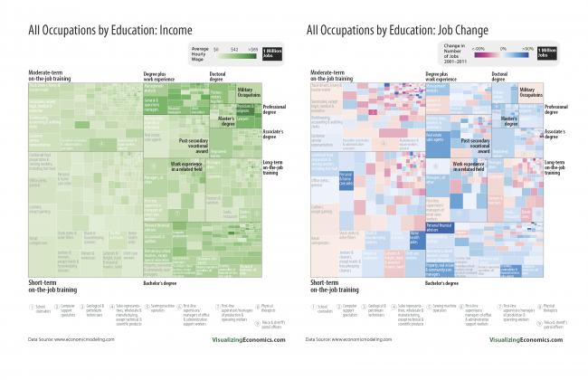
Visuallizing Economics - Comparing All Occupations
Data Visualisation can be both an item, and a discipline. The information will be quantifiable, and therefore in the form of numbers. Data Visualisations should be objective and the entire data set may very well be presented without editing. There is a greater interest in the gestalt, and less about applying an editorial process.
Data Visualisations can be created for the purposes of making sense of the data, or to change a data set into a more accessible form. Often data sets can be so massive and unwieldy that it can be almost impossible or laborious for a human to process. Therefore Data Visualisations are far more likely to be generated automatically through the use of algorithms or computer programs.
The process that is used to create them could be applied to another data set.
They are likely to be presented without context.
The system of organising the data will perhaps be proprietary, and it is this system itself that becomes the interface that the data is accessed through. The data itself becomes its own architecture.
The graphic design of it (in the sense of the look and the feel) will likely be deliberately less obvious, and take a back seat to the data itself.
Compare and Contrast
In the process of making either one, there will be always be a number of prototypes that must be constructed. Each one of these could be considered a Data Visualisation. Infographics can contain Data Visualisations, but Data Visualisations cannot contain Infographics. (Unless perhaps it were a Data Visualisation of Infographics!). Like the difference between a ship and a boat, a boat can go on a ship but not the reverse.
The difference between them can perhaps be also thought of as the difference between data and information. Information is refined data, just as an Infographic could be thought of as a refined Data Visualisation. The word Infographic is even a contraction of information graphics. Both hopefully lead us to the still more refined state: Knowledge.
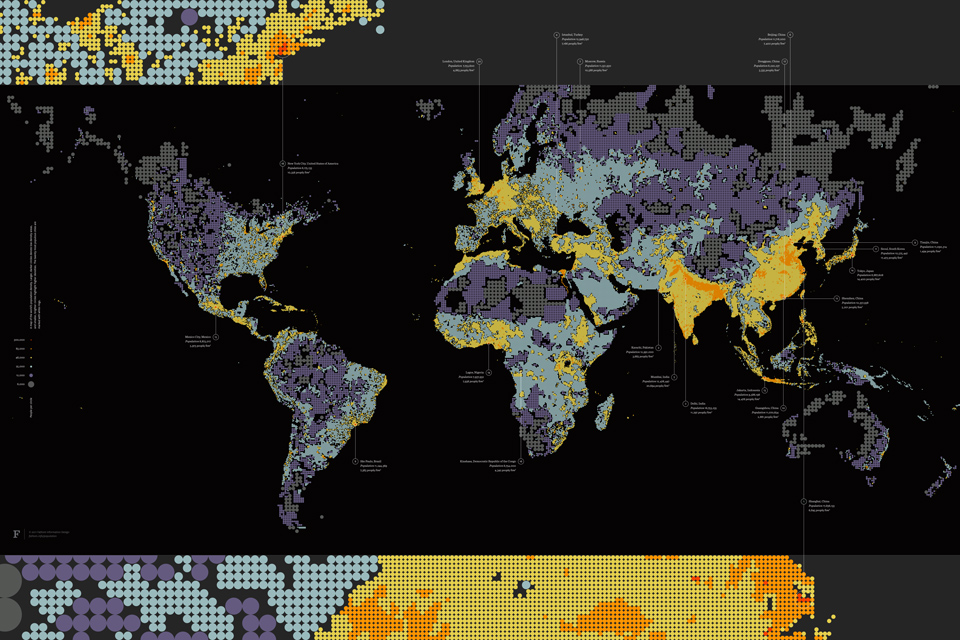
Fast Co Design - Strange Brilliant Map